AeroSpace~


 Here, you can enjoy the safe and warm wonders of what the world was promised to be...


What is this place?
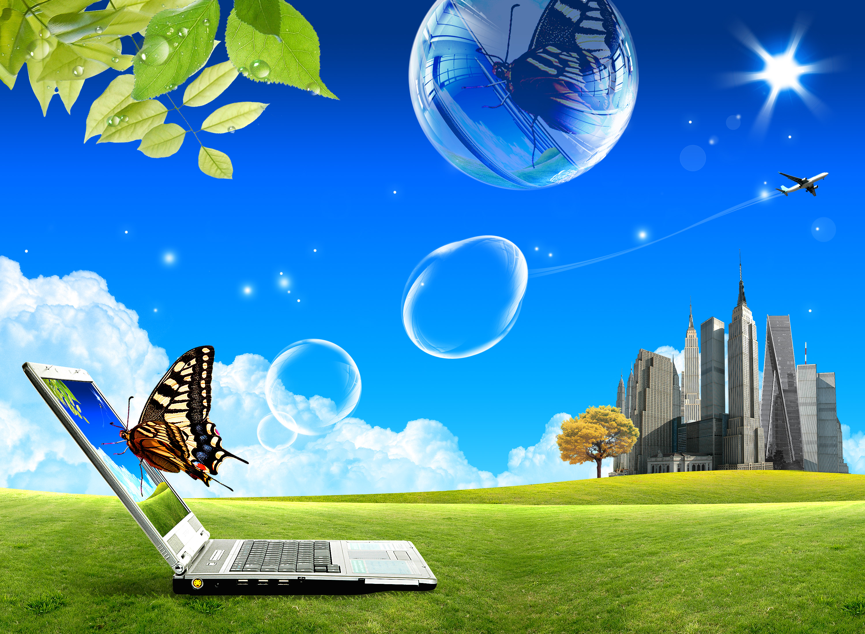
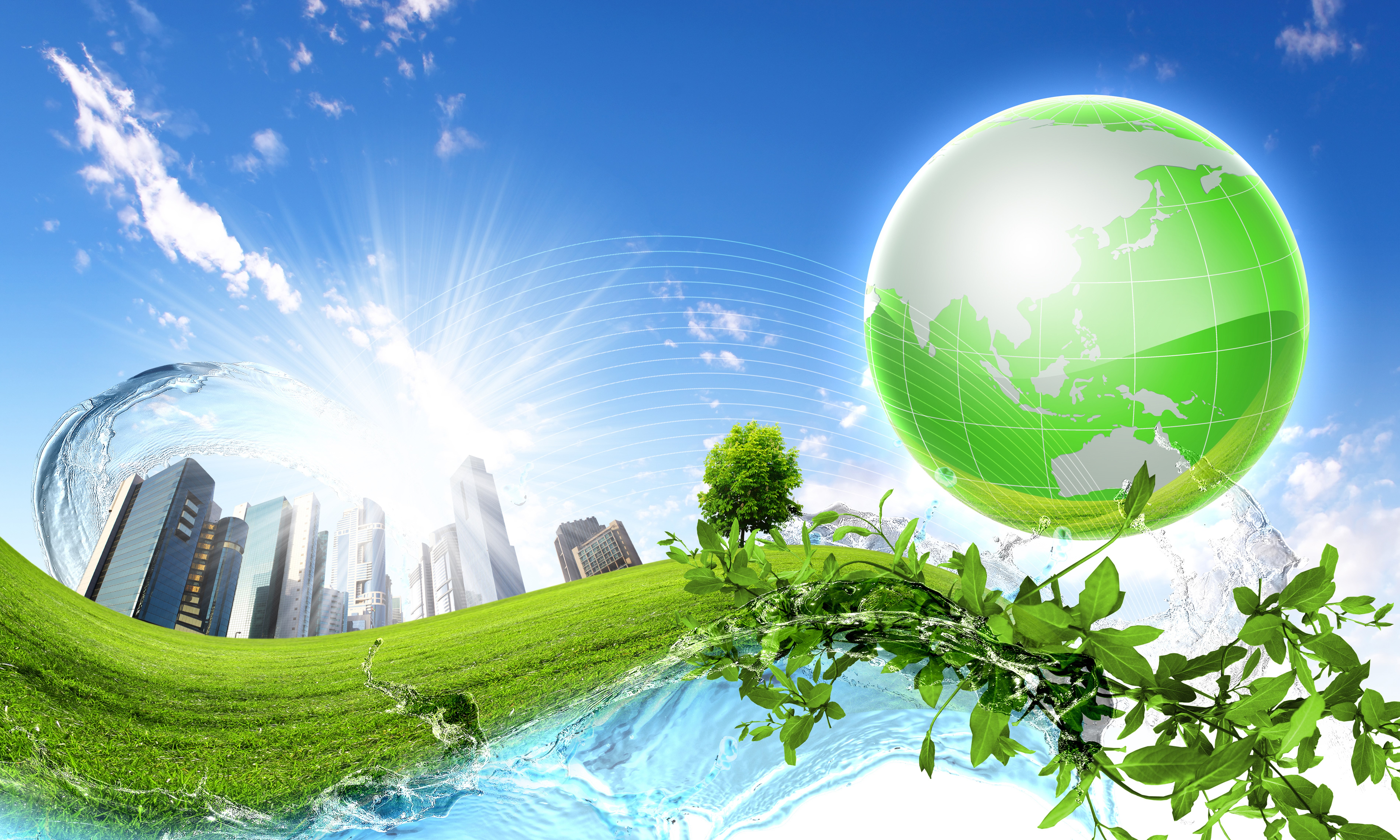
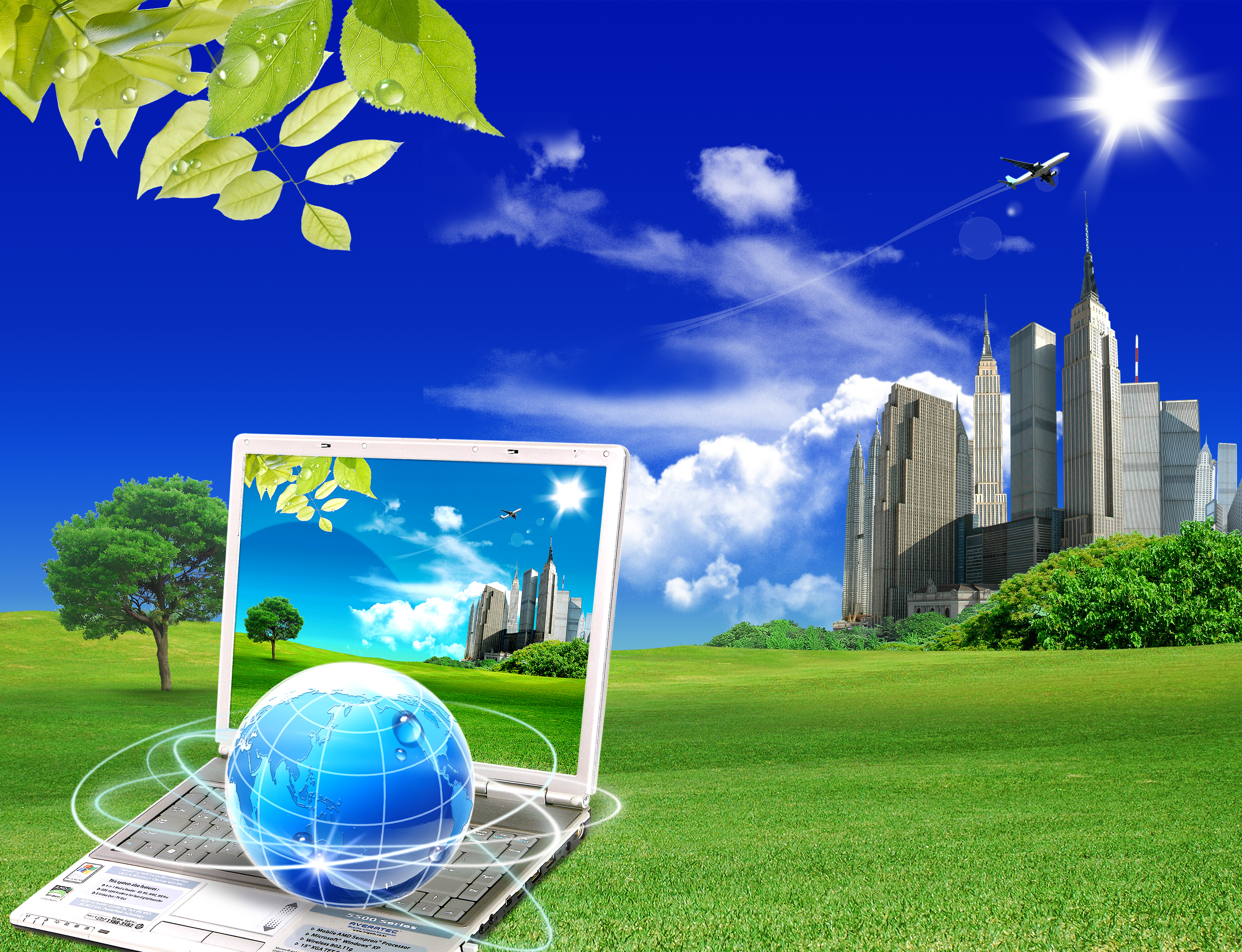
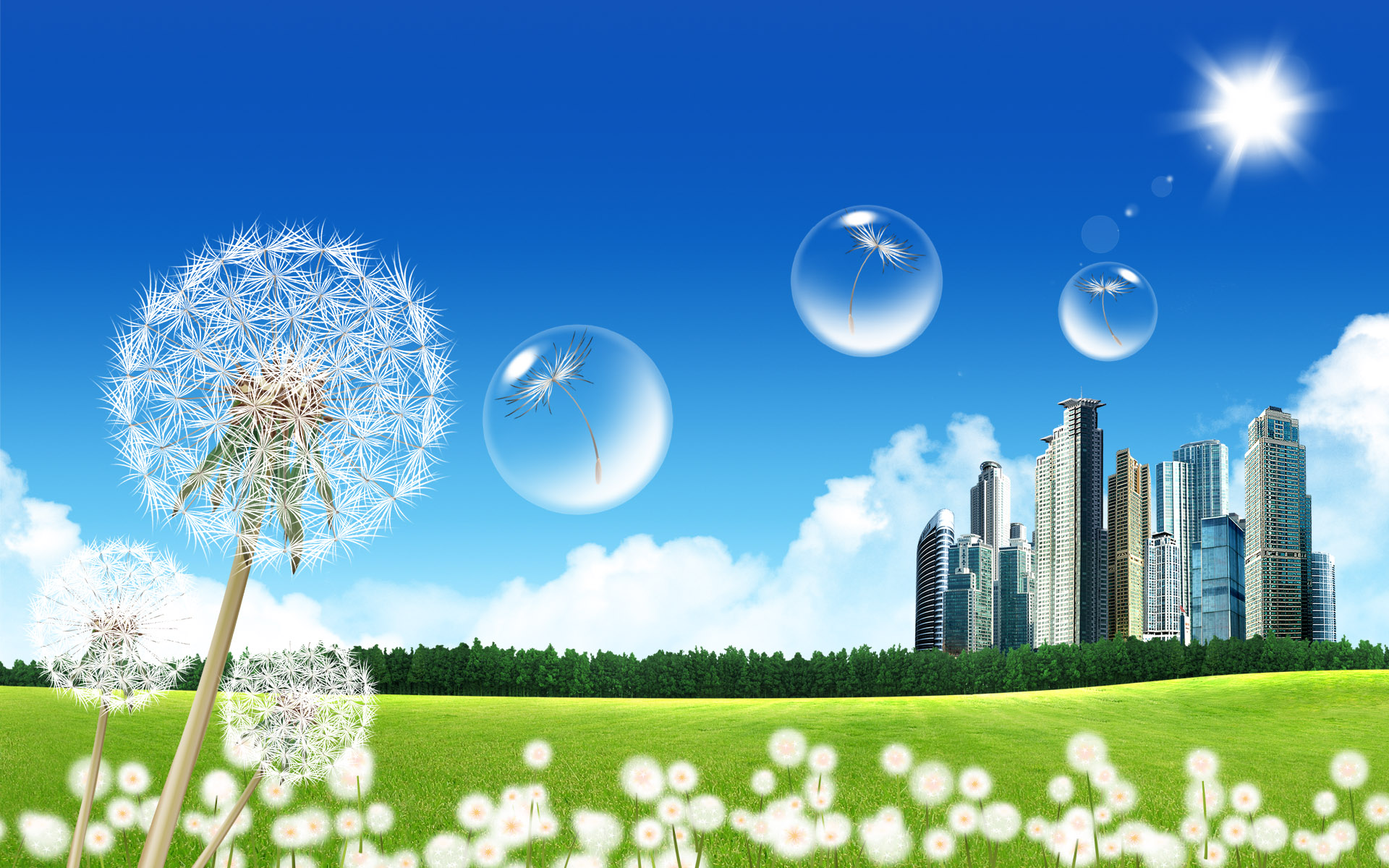
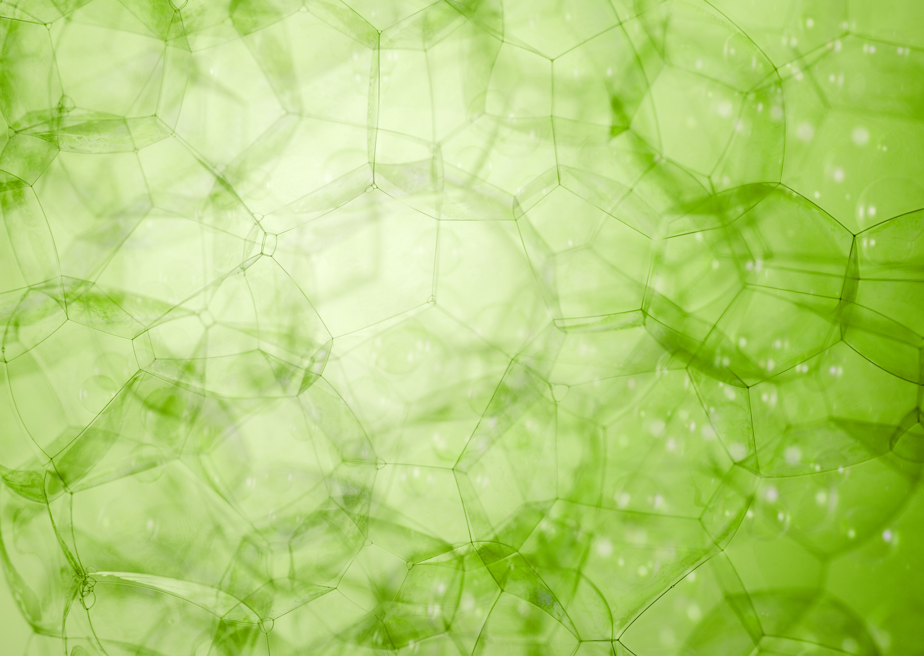
This is our home! Our little world to revel in the lovely displays and aesthetics of Skeuomorphism and Frutiger Aero!
But what is Skeuomorphism?
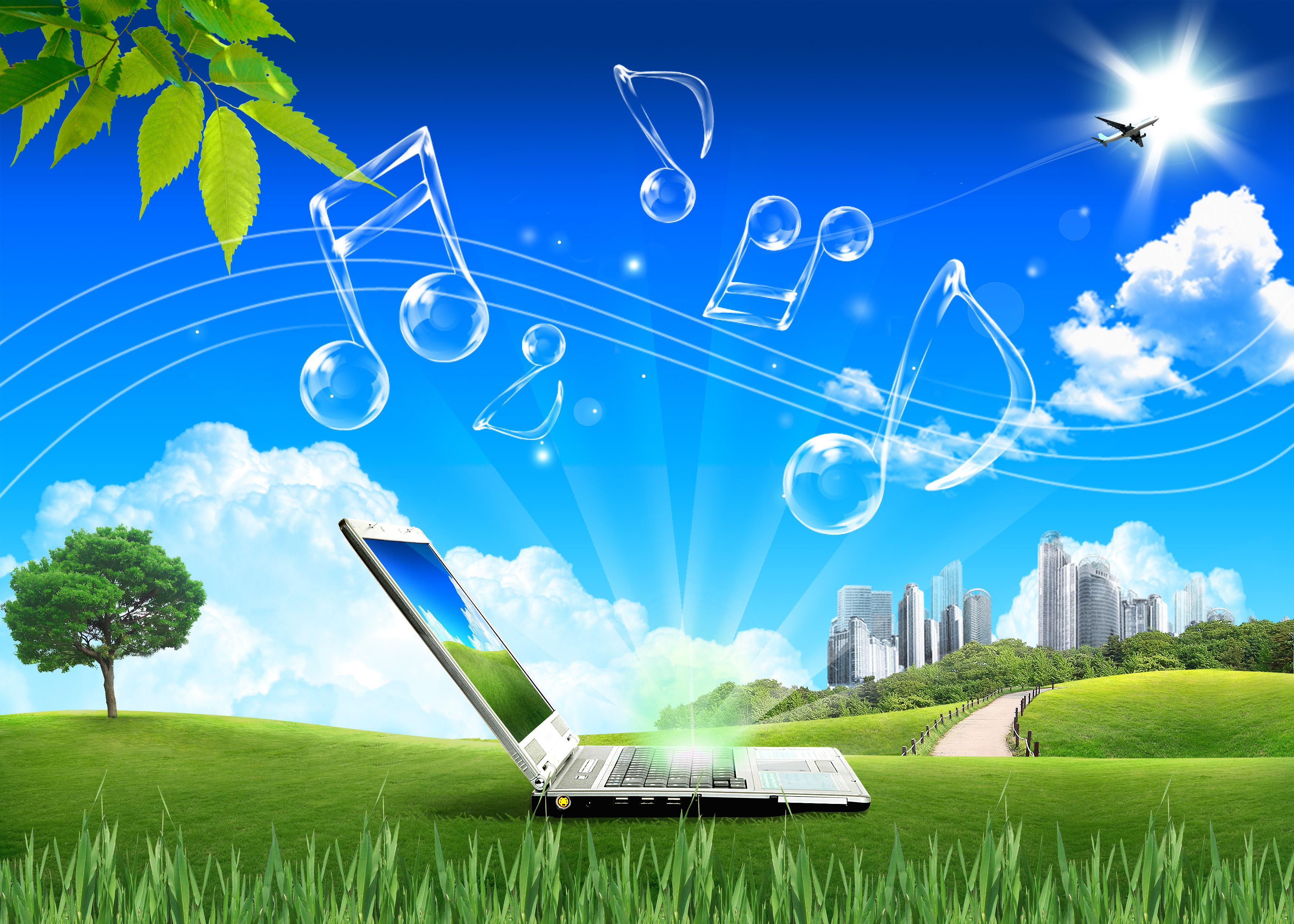
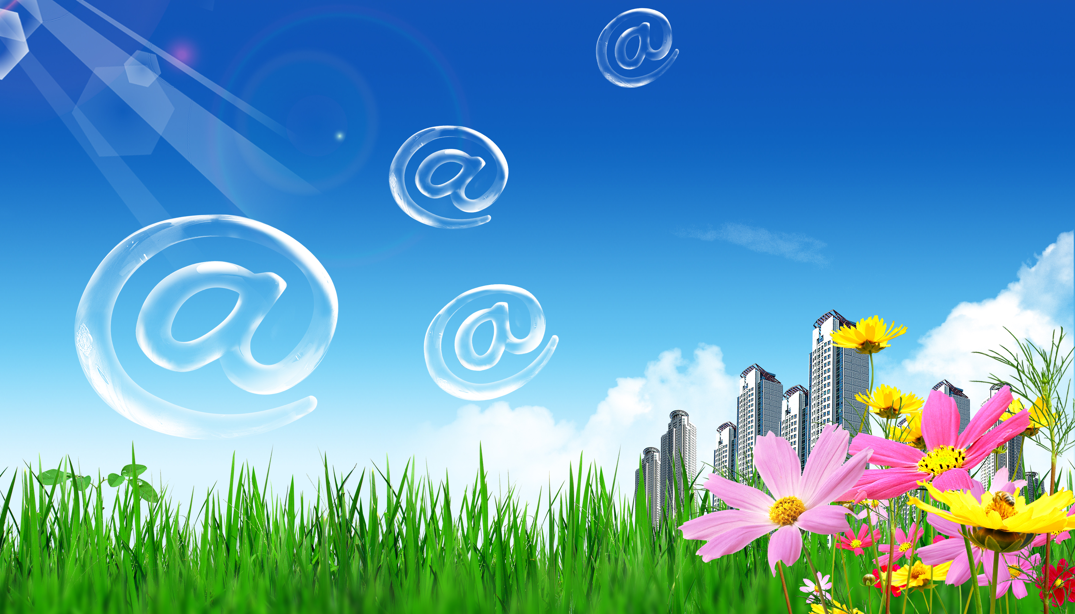
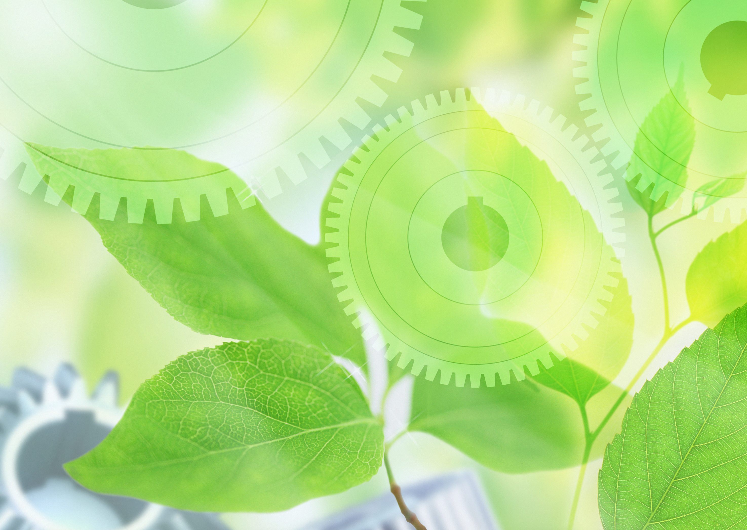
Well, Skeuomorphism is a design concept where digital elements mimic their real-world counterparts through visual cues like textures, shadows, and shapes to make them feel intuitive! Skeuomorphic examples are things such as the old app icons and wallpapers for the iPhone, or the glossy glass-like look of the Windows 7 UI!
I see. What's the origin of Frutiger Aero?
According to the Frutiger Aero Archive, the word "Frutiger" comes from the typefaces of the same name designed by Adrian Frutiger, a Swiss typeface designer responsible for fonts commonly seen in airports, transportation, and train stations. Those fonts would inspire computer fonts during the 2000s, notably Segoe UI which was used in Windows Vista onwards. The second part of the aesthetic's name "Aero" refers to the design guidelines for Windows Vista and Windows 7, which embraced a futuristic, glossy, and transparent glass look.
Interesting...Is there any meaning behind the aesthetic?
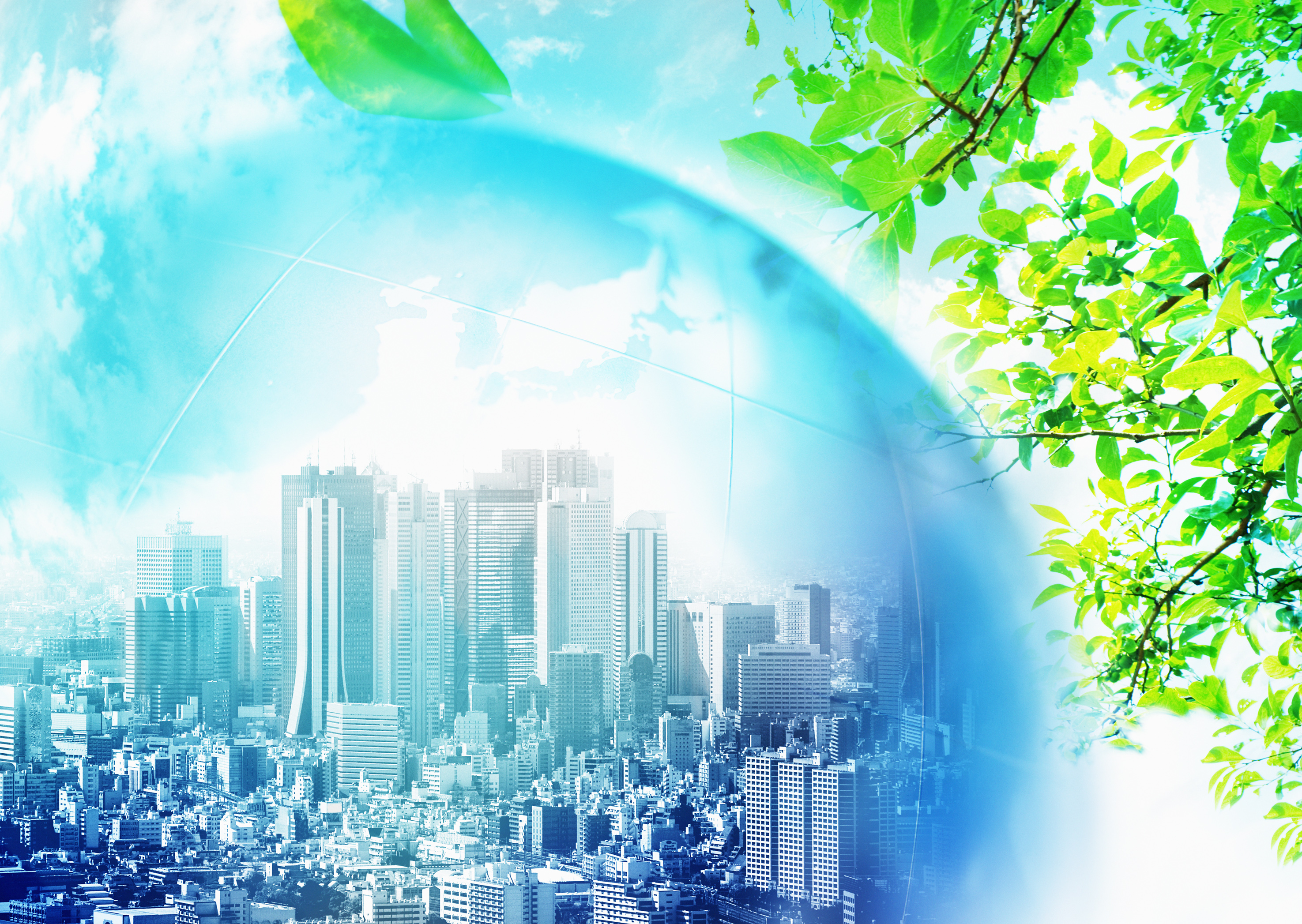
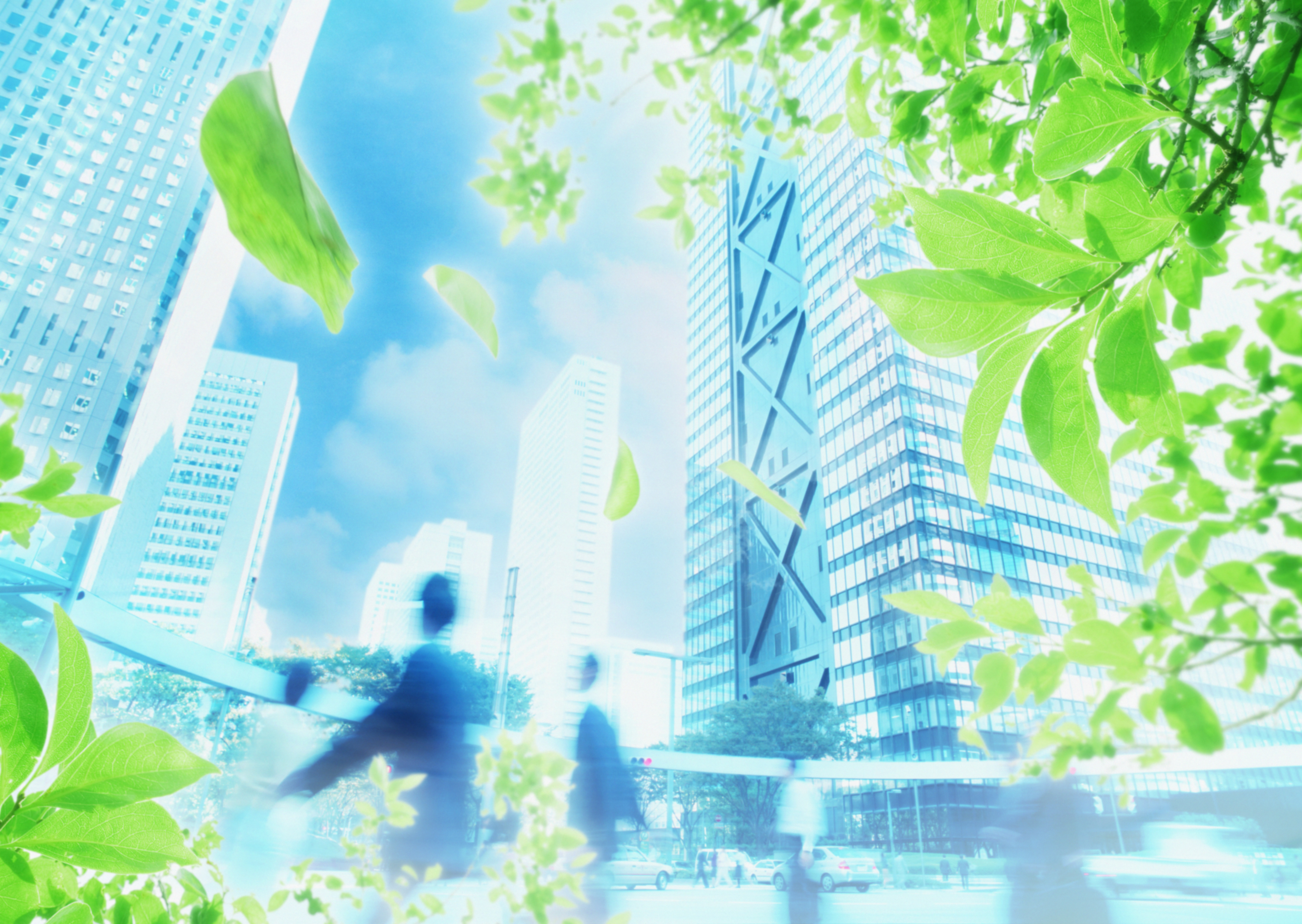
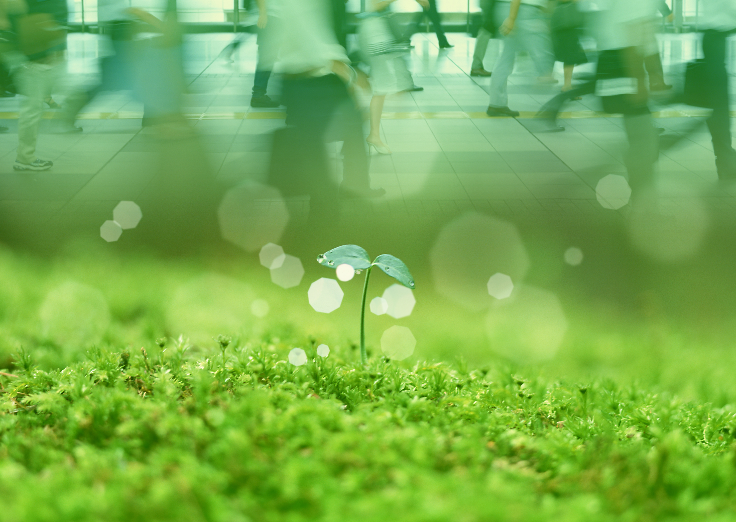
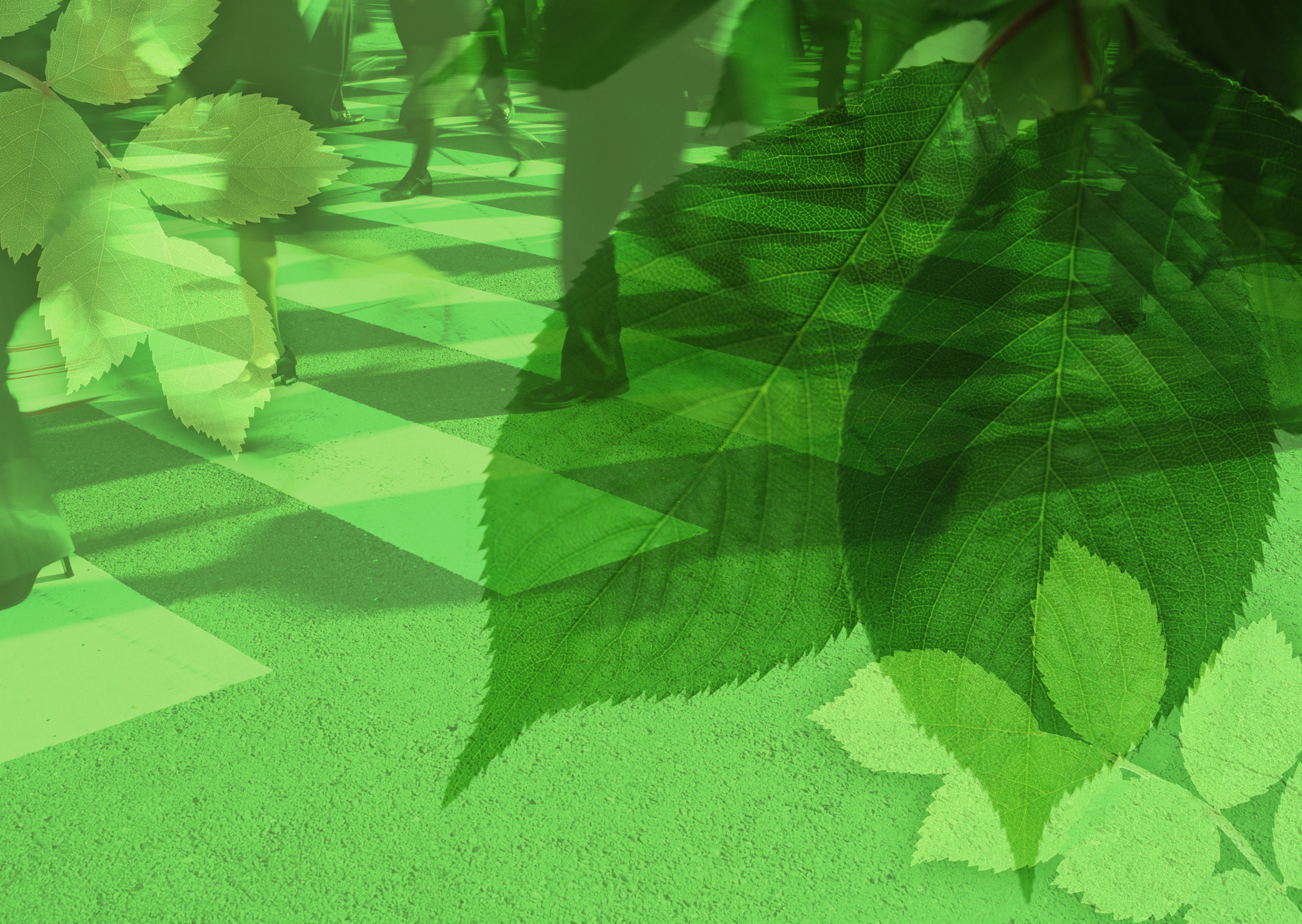
Yes, actually! Frutiger Aero is meant as a stand against big corporations ruining our environment and future. See, big corporations and companies at the time were obsessed with this promise of a sleek, glossy, and clean future (this is how they sold their tech, btw). They promised society with optimistic, natural, and user-friendly tech, just to make a bigger buck for themselves. Frutiger Aero takes this cruel lie promised by these big companies and throws it back at them, using the imagery made by these corporations to fight for the future everybody was originally promised. Since the rise of flat-design and drab corporate design, Frutiger Aero has had a boom in popularity; circa 2022. Due to this uprising of nostalgic and beautiful design, people in the community have been demanding sincerity, nature, and a break from the chaos of the modern internet era. The modern revival in 2022 pushes back by reclaiming the aesthetic's optimistic tech-meets-nature feel as a lifestyle, not just a corporate tool - urging a return to simpler, aspirational tech, contrasting with flat, sterile designs.
Woah okay, that's a lot to take in... that's a good reason to fight against big companies and corporate scandals though, this aesthetic is drawing me in!